Facebook recently unveiled a redesign of the existing profile pages that is sure to improve user retention rate and overall user experience. The features status updates laid out chronologically in two columns, with interface design improvements and a custom "Cover" image that displays behind your profile picture. Improvements to the interface design create a more enticing canvas for creating a personalized look and feel and can be used as a value-add for your clients or to communicate your own brand or style. Business pages will soon be converted to a similar layout, making custom FMBL a thing of the past and placing more importance on branding status updates, using the Facebook gallery and finding unique ways to use the Cover image. For now, the new Timeline profile can be accessed through a developer app, and only users with the app enabled will be able to view your new profile. Follow these simple steps to enable it for your profile:
1. Go to https://developers.facebook.com/ and click on "Apps."
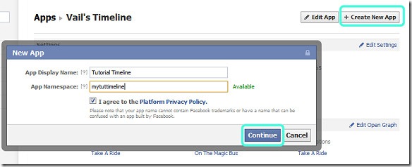
2. Click "Create New App" and fill in the App Display Name and App Namespace.
- The namespace cannot have any spaces, ironically.
- Click Continue to move on to the next step and enter the Captcha
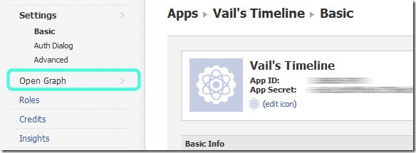
3. Click on the Open Graph link to the right of your App summary.
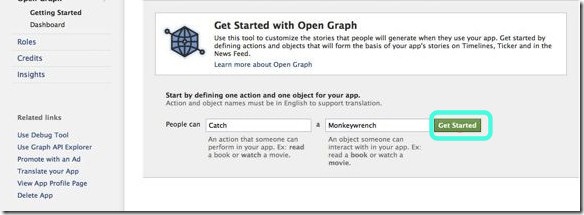
4. Enter anything you want into the "People can" and "a" fields. The first word should be a verb, and the second a noun. Click "Get Started" when ready.
5. Your app is now created. Head over to your profile and click the "Get it Now" button to enable the Timeline. Upon release of the new profile, cover image generators are sure to turn Facebook into MySpace light. Get a head start on everyone else by developing some creative ways to use the new profile elements to break away from this norm. Here are five tricks to get you started:
Customizing the Cover Image
Below, I’ll show you a quick mockup method to customize your cover image and apply an elegant shadow to your profile pic.
Step 1
Click on the "Add a Cover" button at the top of your new profile. Choose any image that is larger than 850×315 simply to give yourself a starting point. Launch Photoshop and create a new document that is 850 pixels wide and 370 pixels tall.
Step 2
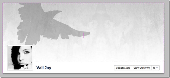
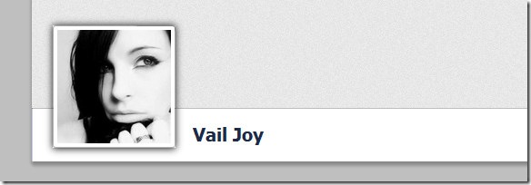
Take a screen print of your Facebook profile, then return to Photoshop and place the screenshot into your canvas. Align the top and left of your cover image with your document edges, which should leave you with the full cover image plus your profile pic:
Step 3
Use the Rectangular Marquee Tool to select your profile pic, including the white border. Copy the selection, create a new layer, and hit Ctrl+V(PC) or Cmd+V(Mac) to paste the selection into the new layer. Select your background layer and use the Rectangular Marquee Tool to select the cover image area:
Fill the area with a light color, gradient or background texture, or use "File > Place" to import a background image.
Step 4
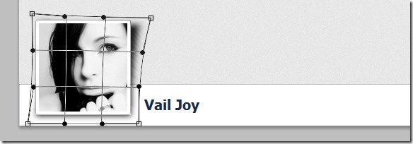
Create a new layer between your top layer and your new background. Choose the Rectangle Tool and set the foreground to a dark gray. Draw a shape behind your profile image that is roughly the same size. Click on "Filter > Blur > Gaussian Blur" and set the Radius to 4. This effect alone gives you a soft shadow on all sides.
Choose the Move Tool and click the corner of the shadow to enable the transform tools. Right-click and choose Warp. Drag the nodes on the right side out and down to create the illusion of the page peeling away:
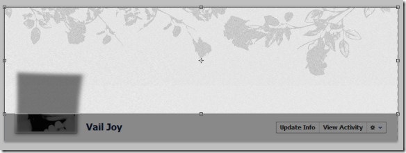
Experiment with the shape and opacity of your shadow to achieve the effect you want. Here is my finished example with an adjusted height:
Step 5
Turn off the profile pic layer and crop your image along the cover image border to get your finished image.
Use this method to create any number of effects. Here is some inspiration:
Quote/Text Bubble
This trick uses a matching avatar background to make it look like it is part of the cover image. Even though the profile pic border is visible, it is so light that the effect still works. 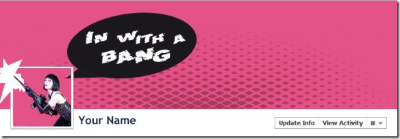
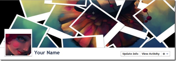
Photo collage
There are several services already that will create a photo collage from your Facebook photo albums, but nothing about the result will be unique or interesting. Try this popular Polaroid collage technique to create a colorful cover image and use a matching profile pic to make it look like your avatar is coming out of the collage.
Profile Pic+Cover Image Antics
Think outside the box…or in it! Your profile pic can be used in endless ways to play off your cover image.
Call to Action
If you post content that speaks to a crowd beyond your inner circle, promote the new subscription feature by highlighting it using your cover image.
Featuring Posts/Images in the Timeline
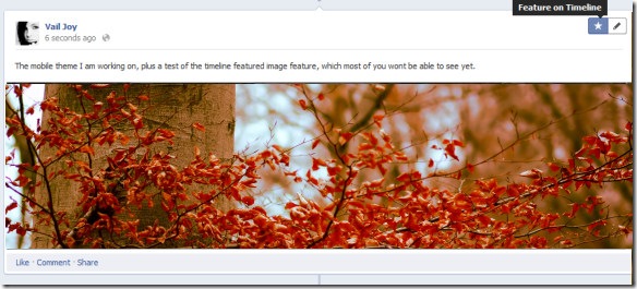
Your profile pic and cover image aren’t the only visual elements that can brighten up your profile. The Timeline allows you to feature any post to expand it to full-width. This is an excellent way to showcase a new design or display a large format photo.
Additionally, using photos in posts helps them stand out in the stream and beautifies your profile page considerably.
Leave a link to your profile in the comments below and show off your creative ideas!
Author Bio –
Vail from DesignArticleWriters.com is a designer and tech blogger who enjoys writing everything and anything about design and tech. She love to recommend people who provide awesome stock photos to design community around the globe.


